
Matplotlib is Python's fundamental plotting library that provides:
import matplotlib.pyplot as plt

# Create simple line plot
x = [1, 2, 3, 4, 5]
y = [2, 4, 6, 8, 10]

plt.plot(x, y)
plt.title('Simple Line Plot')
plt.xlabel('X-axis')
plt.ylabel('Y-axis')
plt.grid(True)
plt.show()
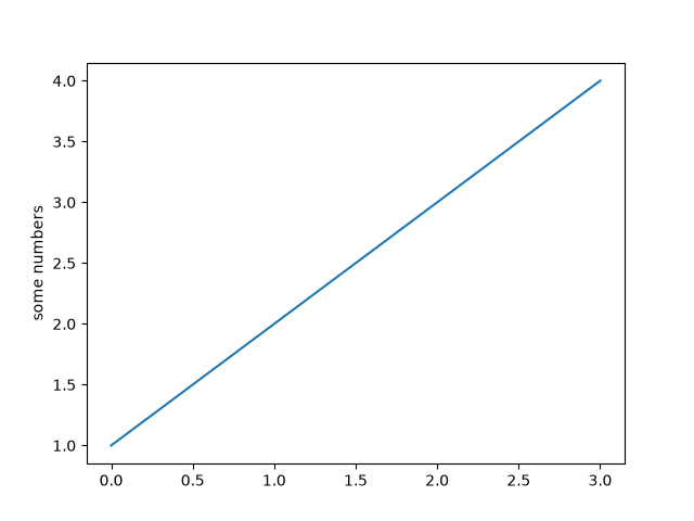
Figure 1: Basic line plot example
# Create figure with subplots
fig, (ax1, ax2) = plt.subplots(1, 2, figsize=(10, 4))

# First subplot
ax1.plot(x, y, 'r--')
ax1.set_title('Red Dashed Line')

# Second subplot
ax2.bar(x, y, color='g')
ax2.set_title('Green Bars')

plt.tight_layout()
plt.show()
categories = ['A', 'B', 'C', 'D']
values = [15, 25, 30, 20]

plt.bar(categories, values, color=['red', 'green', 'blue', 'cyan'])
plt.title('Bar Chart Example')
plt.show()
import numpy as np

data = np.random.normal(0, 1, 1000)
plt.hist(data, bins=30, edgecolor='black')
plt.title('Histogram of Normal Distribution')
plt.show()
x = np.random.rand(50)
y = x + np.random.normal(0, 0.1, 50)

plt.scatter(x, y, c='purple', alpha=0.7)
plt.title('Scatter Plot with Transparency')
plt.show()
Seaborn is a statistical visualization library built on Matplotlib that provides:
import seaborn as sns

# Load example dataset
tips = sns.load_dataset('tips')

# Create a boxplot
sns.boxplot(x='day', y='total_bill', data=tips)
plt.title('Boxplot of Total Bill by Day')
plt.show()

Figure 2: Seaborn boxplot example
# Pair plot for multivariate analysis
sns.pairplot(tips, hue='sex', palette='husl')
plt.show()

# Heatmap for correlation matrix
corr = tips.corr()
sns.heatmap(corr, annot=True, cmap='coolwarm')
plt.title('Correlation Heatmap')
plt.show()
# Create a customized plot
plt.figure(figsize=(8, 6))
sns.set_style('whitegrid')

ax = sns.barplot(x='day', y='total_bill', data=tips,
                 palette='viridis', ci=None)

ax.set_title('Average Bill by Day', fontsize=16)
ax.set_xlabel('Day of Week', fontsize=12)
ax.set_ylabel('Average Bill ($)', fontsize=12)

# Add value labels
for p in ax.patches:
    ax.annotate(f"{p.get_height():.2f}",
                (p.get_x() + p.get_width() / 2., p.get_height()),
                ha='center', va='center', xytext=(0, 10),
                textcoords='offset points')

plt.tight_layout()
plt.savefig('custom_plot.png', dpi=300)
plt.show()